Neva (ENG)
All images and videos of the game were captured by me on PS5.
Summary
Controls
Very consistent, comfortable, and fun to use (especially the aerial dodge). It uses techniques like input buffering, where the next input executes right after the current action ends, and “coyote time”, allowing you to jump a few pixels past the edge of a platform for a few frames after you’ve technically run off.
A lot of game language has been simplified, such as pressing “Down + Jump” to drop through platforms, along with other concessions for the combat system, which are explained in a later section.
The following proposals aim to improve the control experience, ordered by importance.
Game Tuning
Collision smoothing (VERY IMPORTANT)
In platforming sections—especially moving ones—collisions are extremely precise, making it hard to judge jump and dodge distances so that Alba doesn’t hit the edge. This can cause a lot of frustration in more demanding platforming areas or arena-style combat sections, where you need to return to a platform after attacking an airborne enemy or dodge near the edge. A lot 🥲.
In these situations, smoothing collisions around platform edges would massively improve the experience. Players aren’t as mechanically precise as they think—just like with “Coyote Time,” this would prioritize player intent over strict simulation. It’s the kind of design touch that elevates a solid platformer into an excellent one.
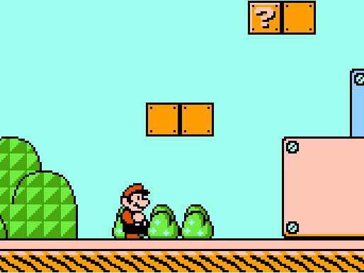
The game redirects Mario and slightly boosts his jump height if he barely misses a jump. Similarly, it prevents him from bonking his head if he’s just pixels away from hitting something, nudging him away smoothly.
The dash in “Celeste” behaves similarly.
“Why Does Celeste Feel So Good to Play?”, Game Maker’s Toolkit, 31 Jul 2019.
Walking
Alba uses a button to move, so she’s either standing still or running at full speed—there’s no in-between for slower walking like you’d get with an analog stick. In a game with such a strong aesthetic focus, being able to slowly stroll through a scene while the perfect music plays becomes a memorable moment (and potential viral factor). Personally, I’ve recorded tons of clips like this in “Zelda TotK” or “Wukong”. It’s understandable that with hand-drawn animation this would take a lot of extra production time, but in my opinion it’d be well worth it—these are the kinds of moments players remember over time.
Combat System
Thanks to the polished controls, combat is satisfying most of the time. For example, the basic attack: as soon as the button is pressed, Alba strikes almost instantly, with no anticipation. There’s barely any delay between the player’s intention and the action.
Another key factor is the use of hurtboxes (the areas that damage the player) being smaller than the enemy sprites, making dodging easier.
Here are some proposals to improve the experience, also ordered by importance:
Game Tuning
Sword range and feedback
The goal of every game system is for the player to build a mental model of it that mirrors how it actually works. Learning the system—building that mental model—and then seeing it play out in-game exactly as imagined is what we call fun.
One pain point in building this model lies in the basic combat action: hitting with the sword. While the sword’s sound effects are fluid and detailed, when zoomed out it’s hard to see the attack’s area of effect—it doesn’t contrast enough with the environment, so the player can’t easily learn the sword’s range, making it harder to internalize (and build the mental model).
Also, the attack’s hurtbox is quite small and doesn’t stay on screen long enough, which makes it hard to judge distances during combat. Hitmarks (where the attack connects) are a bit more visible but could still benefit from additional layers of visual effects to improve clarity.
Taking “Super Smash Bros. Ultimate” as an example (we should learn from the best), it manages noticeable effects even at major zoom levels by layering multiple sfx for contrast and keeping them visible throughout the entire attack area—which is larger than what’s seen at the moment of impact. Once again, it favors player intent over realism.
“Visual Effects in Slow Motion [Effects]”, Masahiro Sakurai, 28 Feb 2023.
You can see how the effect appears suddenly and lingers during the follow-through.
Interestingly, there’s an example in Neva that comes closer to this suggestion: the Final Boss. The areas of effect for each attack are clearer, though the effects still should linger longer—more like the “Smash Bros.” example. In comparison, Alba’s attacks are barely visible.
Depth vs Demands
As mentioned earlier, combat is simplified and doesn’t allow for actions like attacking upwards or expanding the basic combo. While the design choice is understandable, this lack of depth turns longer or more demanding fights into endurance trials instead of mastery tests.
It also exposes a disconnect between simplifying the combat system and how demanding some sections are. Examples include arena fights with multiple enemy waves, especially fliers, or boss fights (which, I must say, take great inspiration from From Software — bravo!).
If combat remains demanding, it could be expanded easily using sweet/sour spots on the sword. That means attacks deal more or less damage depending on what part of the sword connects: more at the tip (sweetspot), less at the base (sourspot), encouraging proper spacing.
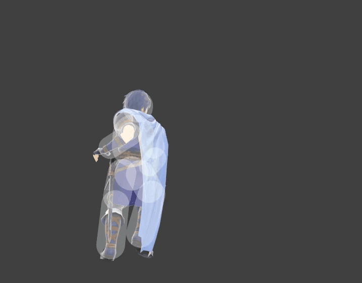
The red circle shows the sweetspot; the others are sourspots
More info here.
Adding more attack directions would also bring more freedom and dynamism to combat—but that would require a lot more production effort across all departments.
Level Design
Level design is consistently high. New mechanics and enemies are introduced Nintendo-style, narrative progression is used cleverly—Neva grows and can now traverse platforms that were previously difficult—and puzzle designs smartly reuse the same elements to open new paths. One action often yields several elegant outcomes, and the hidden paths to collectible flowers are a nice touch.
It’s true that the player has to learn how to read level navigation (what areas are walkable, what’s a wall, what’s background, etc.), but this is a big step forward from “Gris” thanks to bold, high-contrast outlines on walkable paths. Once you’ve internalized it, it’s quite consistent—Chapter 2’s ending plays with this idea in a clever way.
Only one element in this section causes major friction during level navigation—which I consider quite critical. It’s explained next:
Game Tuning
Climbable Area (White Flowers)
Climbable areas, marked by small white flowers, are very hard to spot when zoomed out—especially in light-toned environments or snowy scenes, where snowflakes are the same size as the flowers and they blend completely into the background.
Several times I wasn’t sure where to go next and had to scan the screen for tiny white dots, which pulled me out of the game’s immersion—and I was playing on a 65” LG G3 TV with HDR (the game looks stunning, by the way). A player thinking about how to play instead of playing is something to be avoided at all costs—it breaks the “magic circle” that gameplay creates.
When I returned to the game to write this analysis, the flowers were easier to spot—but that may be because I already remembered the path, not because of clearer visual design.


Here are some scenes where the flowers are hard to spot. I found myself stuck, staring at the screen, trying to figure out where to go.
It’s a delicate problem to solve—it directly affects the game’s visual style (its main focus), yet also causes friction in gameplay experience. And in the end, this is a video game.
Since this isn’t my department, the art team has the final say—but there’s usually a way to find a compromise that benefits all disciplines involved.
The ideal solution would be to increase the number of flowers or layer them with more colors to ensure contrast. However, I suggest a solution that requires no changes to existing environments: a contextual particle system.
Just like a particle trail appears when you need to interact with Neva, similar particles could appear contextually if players don’t interact with the flowers after a certain time.
A simple documentation for such a system might look like:
Maintain a list of climbable flowers in Unity and track which ones the player reaches, resetting progress if they fall.
Each flower includes a parameter to check if the previous one must be activated.
Certain elements (like gongs in special zones) can enable/disable flowers.
Climbable flowers that lead to collectible ones are excluded.
If the player is in the scene and combat is over, after an adjustable time (e.g. 10 seconds), a particle trail appears from their position to the next set of flowers. When touched, the trail disappears.
If the player lingers on certain flowers, another trail appears to guide them to the next ones. Once reached, it disappears.
Exception: Not applied in sections where it’s unnecessary (e.g., Chapter 3’s wall-jumping block-dodge sequence or scenic climbs).
Bonus: Add a menu option to toggle this help system on/off.

When you enter an area, the first flowers are inactive.
Each area has a target point for the particle trail.
Each Gong activates a pair of flowers.

Gong A activates flowers 1 and 2.
After 10 seconds, the trail appears and leads to point (1).

Flower 2 depends on Flower 1 being active.
After 10s, a new trail appears.

Gong B activates flowers 3 and 4.
Flower 3 doesn’t depend on 2. Trail appears.
Flower 4 depends on 3.

In this case, flower 4 depends on Flower 3 to activate.
Conclusion
The game delivers a great experience and is of very high quality. At the same time, it raises the mechanical demands of gameplay compared to Gris, so making interactions as smooth as possible to meet those demands would be ideal.
Many of these suggestions are “fine-tuning” points—but they’re the ones that aim to push the experience toward the highest level of quality.
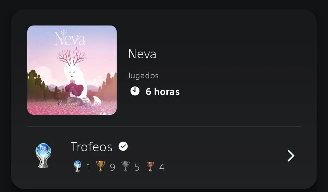
P.S.: I got the Platinum.